We know how hard it can be to find smart portfolio solutions to navigate the macro, digest the micro, and then act when it comes to investing in this year’s volatile environment.
In today’s Market Report, we step away from our bemused critiques on the broken “big picture” and get down to the current pavement of how we build portfolios to protect clients at the portfolio level.
Toward that end, we will share market content previously provided to our Subscribers in a Subscriber weekly update we call Pulling It All Together, where we digest what’s going on now, make the takeaway simple, and then design five Model Portfolios from conservative to aggressive that model what’s working now.
The nomenclature may seem traditional, but the Portfolios we publish are far from the 60/40 stock/bond portfolios that are about to be punished in a rising rate eventuality.
For example, in Pulling It All Together for this week, we drew attention to the following, all of which was shared with Subscribers over the weekend so they could be prepared for the week ahead:
- The Big Picture
- It’s All About Interest Rates
- Sector Rotations Sound the Alarm
- Take Your Queues from the Flows
- Portfolio Hedging
Let’s dig in.
The Big Picture
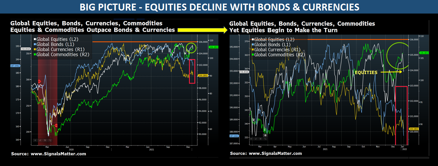
Storm Tracker tracks trends in Global Equities, Bonds, Currencies, and Commodities across monthly, weekly, and daily market indexes and timeframes.
Charted below are all four sectors, daily. Lots of colors and squiggly lines, yes, but if you look closer, they say a lot.
While the lefthand doesn’t appear to have changed much from the last time we published this, the righthand chart begs to differ.
Highlighted by the yellow arrow, global equities (in white) are decidedly tumbling, joining bonds and currencies directionally through Friday, February 4.
Such correlations, of course, are alarming. But as we’ve warned many times, bonds and stocks are both so grossly “over-stimulated” by decades of Fed support that they no longer act as risk-parity hedges.
That is, bonds won’t “zig” as stocks “zag.” Instead, both asset classes can and will fall together. That’s not good…
Commodities
Commodities, on the other hand, continue to climb. To track global commodities, we equally weigh ten indexes that include commodities generally, agriculture, energy, industrial metals, and precious metals.
Commodities are commonly deployed in investment portfolios as an asset-class diversifier and as a hedge against inflation. That’s why they’re rising, and that’s why our Model Portfolios are commodity-heavy.
Right now, with inflation ripping and interest rates about to make the turn, investor flows into commodity ETFs are rising (next block).
Keeping it simple: (1) Three out of four global investment sectors are now correcting/falling. That’s not good either. (2) Commodities are rising, a comparatively smarter bet. (3) Rising commodity prices fuel inflation. (4) Inflation prods central banks to increase interest rates (our next block).
It’s All About Interest Rates
The Economist recently hit the nail on the head with the trillion-dollar question: How high will interest rates go?
We would also add: How fast will they get there?
Since 2011, the Federal Reserve has published a chart known as the “dot plot” below, which maps policymakers’ expectations for where interest rates could be headed in the future. The dot plot is published quarterly, reflecting where each of the 12 members of the FOMC (the rate-setting body within the Fed) expect the federal funds rate to be for each of the next three years and the long term.
Needless to say, our faith in FOMC projections is hardly 100%; nevertheless, we can’t ignore the “Fed factor” in what is essentially a Fed-driven market since 2008.
Interest rates rule and are clearly going up. Hat’s off to the Fed for giving fair warning, although the plotted rate adjustments could easily be too little too late, prompting multiple rates hikes this 2022.
Keeping it simple: Interest rates are going up. That will negatively impact any bond holdings you may have in your portfolios and stocks eventually.
Hedge your bets, especially if your advisor has you in the oh-so-dangerous yet traditional 60% stock/40% bond model.
Sector Rotations Sound the Alarm
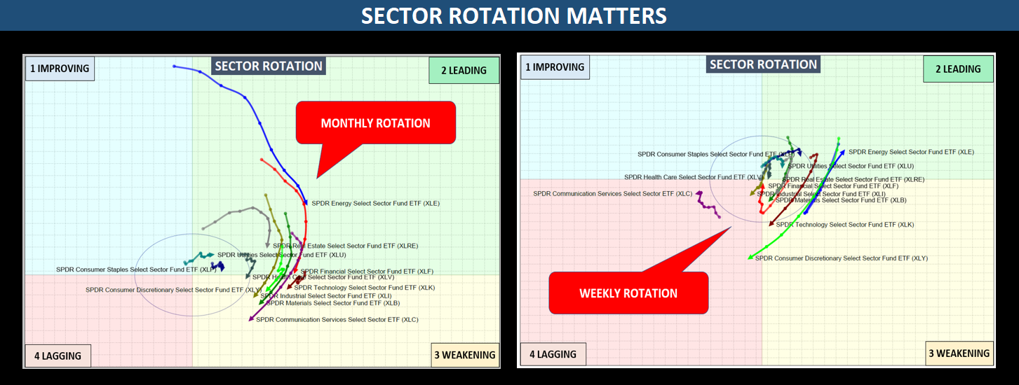
Sector rotations are alarming. This week, we’ve backed up the clock to show you what sector rotations look like monthly, which is not good.
The unified fall of sectors from the Leading Quad to the Weakening Quad below is consistent across all SPDR sectors, and weekly rotations are confused, as we’ve been saying.
Here at Signals Matter, we plot sector our rotation graphs, not against the S&P 500 as most folks do, but rather against an ‘absolute return benchmark,’ call it a 5% annual return. That removes the bias inherent in tracking sectors against themselves, which ultimately confirms a picture consistent with the Big Picture above. Confirmations are good.
Keeping It Simple: Sector rotations confirm weak market conditions and, therefore, the clear need to diversify and hedge.
Take Your Queues from the Flows
Signals Matter is keen on monitoring money flows into and out of ETFs as a means to gauge investor sentiment regarding individual ETFs. After all, supply and demand forces still matter, despite years and years of central bank efforts to distort the same.
While we watch aggregated ETF flows for insight into broad investor sentiment across specific asset classes, sectors, or the market as a whole, it’s the individual flows for each ETF that matter the most when modeling portfolios.
Flows Matter
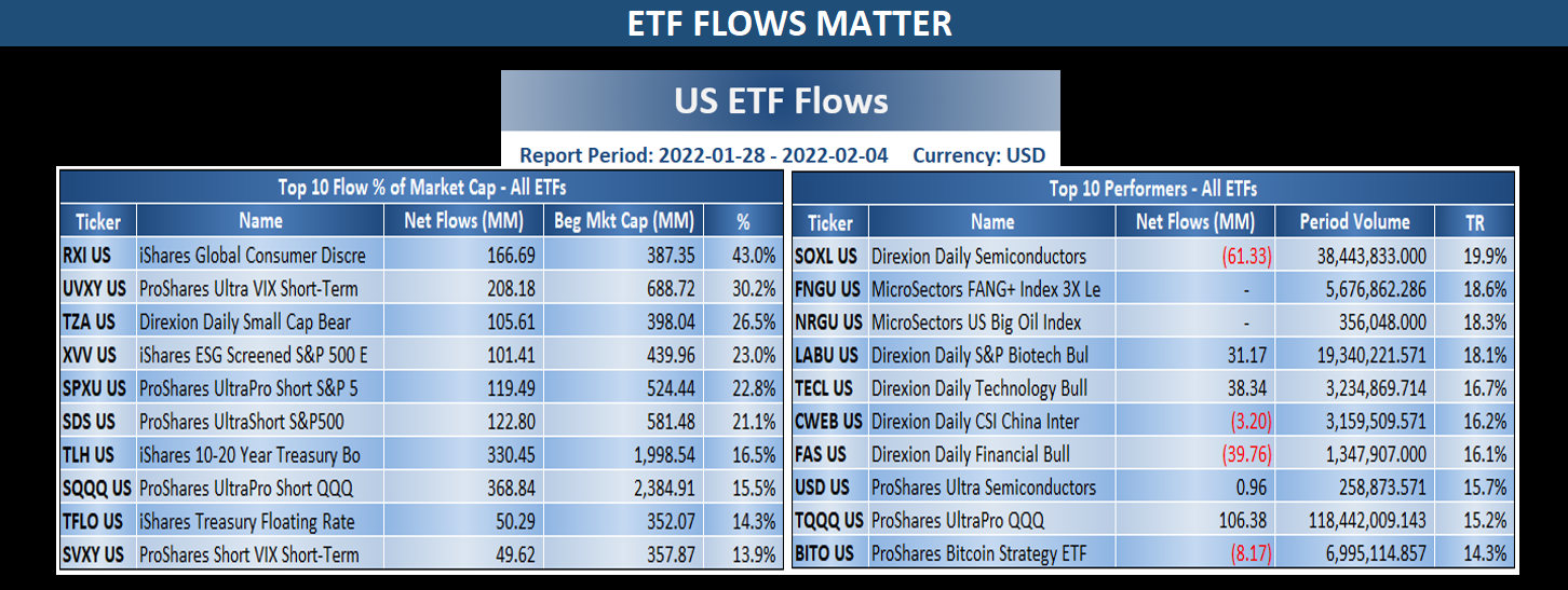
Take a glance at the tables below for the week of January 28 to February 2. On the left, we display ETFs with the Top-10 flows as a % of market cap. To the right, we display the Top-10 ETFs from a performance perspective.
Combining the two provides valuable insight into what’s working now. You’ll see some familiar themes that have matched our recent portfolios, namely: 1) the VIX; 2) short (inverse) ETFs across small-caps, the S&P 500, and the Nasdaq; and 3) long floating rate bonds; semiconductors, oil, biotech, even bitcoin.
Keeping it simple: Net positive ETF investor flows tell us what investors favor, where the demand is, and thus provide a tailwind for performance.
Portfolio Hedging
With (a) equities now in decline along with bonds and currencies, (b) interest rates poised to rise, (c) sector rotations sounding the alarm, and (d) commodities & hedges favored by flows over traditional 60/40 stock/bond investing, we’re following suit.
Why? Because that’s what the market signals are telling us today—and we actively manage portfolios to adjust as markets adjust. The days of passive, set-and-forget euphoria are long past, as such passive approaches are fatal when overbought markets turn volatile.
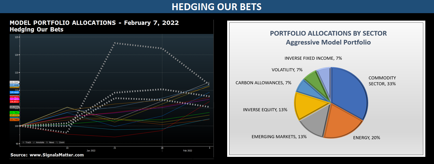
In the left-hand chart below, we’ve plotted this week’s Model Portfolio picks, highlighting our three hedges going into the week ahead.
The dotted hedges are the same hedges we’ve had on for several weeks now, shown to outperform our other picks when the going has recently gotten tough.
Meanwhile, the remaining choices are doing just fine because they follow the trends and the flows into commodities, energy, and emerging markets.
Keeping it simple: Risks are rising. Do as we do. Hedge your bets. Leave the driving to us.
Come join us at Signals Matter so you too can be prepared each weekend for the week ahead, benefit from our Model Portfolios, and hedge as markets warrant.
For further information, here’s what we do: Signals Matter; here’s what our Subscribers are saying: Subscriber Testimony, and here’s where to sign up: Let’s Meet.
Be good, stay informed, and stay diversified!



Are you planning to set up a fund based on your recos ?
If so please count me in
regards
Chris Smith
Sooner than you think 🙂