
Below, we look at recent market graphs on debt, sideline cash, Fed stimulus, the VIX and the bond market. Sometimes a picture speaks a thousand words, and the market graphs below are screaming.
A good friend often told me that market experts aren’t doing their job if they can’t cut through the noise and reduce the complex to “three graphs and a crayon.”
Well, I don’t have a crayon font, but I do have a few graphs worth sharing below. I think you’ll find them pretty helpful in making sense of the nonsense. Moreover, they confirm so much of what we’ve been discussing in prior blogs, from debt levels to junk bonds, or central banks to market uncertainty.
Here at Signals Matter, I’m never one to deny kudo’s to others in the blog-sphere—even those otherwise known as “competitors.” The graphs below come from John Mauldin’s site, and I can’t help but appreciate his straight talk (as well as these graphs).
The same is true of my old neighbor from Stevensville, Michigan and former U.S. Representative and Presidential Budget Director, David Stockman, who has lead a valiant effort speaking against the tailwinds of this Fed-distorted market bubble for years despite the unpopularity of his bull-taunting realism. Kudo’s again.
Whether talking to a doctor, attorney, confidant or spouse, we all prefer straight talk—we are drawn to it.
And that’s what I like about traders, economists and financial veterans like Mauldin or Stockman. They rise above the hype and stick to the numbers, even while the pundits flash their know-it-all smirks in the foreground of a market cancer they daily (and mistakenly) describe as a “recovery” or “synchronized market growth.”
As the numbers and graphs below suggest, there’s nothing to smirk about—with or without a crayon. All the studio bells and whistles, theme music and ticker numbers racing beneath the prompt-readers at CNBC, Fox or Bloomberg Live can’t hide these facts and figures.
No should you or I hide from them.
First, let’s revisit the topic of debt—one I’ve written about here , here and here and many other places too…
In case those articles and figures didn’t hit home, let’s drop the crayon and just ponder the following market graph, which shows the US Credit Market Debt as a percentage of GDP:

As we can all plainly see, we are facing a debt monster. We are way above the debt levels of the Great Depression, yet with none of the future tailwinds to bail us out—i.e. none of the manufacturing and productivity booms that came in the victorious wake of the Second World War.
Instead, we just have mountains of more debt and nothing but weaker productivity to look forward to—a true worse-case scenario.
In sum, America is grotesquely over-levered, and as our four-part history of the markets plainly showed (from FDR to the sub-prime crisis of 08): every market crisis is preceded by a debt a crisis.
So, given that US debt has never been higher, do you still think it’s safe to swim (all-in) in these debt-driven and debt-sodden markets?
Well, apparently, the majority of today’s investors are happy to swim in these shark-infested markets. As the following market graph shows (using Merrill Lynch data as a proxy), investors have never been more “all-in” and thus so low in cash reserves:
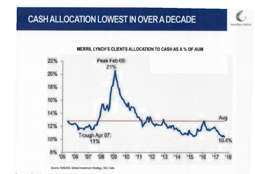
But as above graph should also make clear—retail investors always get it wrong. They limp into cash AFTER markets have crushed them, and nearly always plunge all-in just BEFORE markets carpet-bomb them with losses.
In other words, most investors are buying at tops and selling at bottoms—the very opposite of common sense or trading 101. In short, another recipe for pure disaster.
From 2005 to the present, the above data confirms that Merrill Lynch clients average about 13% in cash, and are currently at the lowest cash percentages of 10.4%—even lower than the 11% cash reserves they held just prior to their 08 massacre.
How and why Merrill Lynch clients who got skewered in 08 would follow that same sell-side bank of cheerleaders into another bull-trap is…well: odd. So why do they repeat the mistakes of the past?
Easy. Investors are drunk on the euphoria stage that precedes all market blow-offs.
Like sheep being led to slaughter, they have depleted their cash reserves to buy the most over-priced FANGs et all at valuations described elsewhere at the very worst time to do so…
Apparently their “wealth advisors” at Merrill Lynch (the same bank that effectively collapsed in 08 only to be revived by Bank of America) haven’t been reminding clients of the otherwise obvious risks in these markets.
But investors (in and outside of sell-siders like Merrill) just need to look around them to know better…
Paintings selling for half a billion dollars? Bitcoin soaring by 900%? Junk-bond yields falling as default risk skyrockets? Global stock market capitalization rocketing to over 110% of global GDP? FANG valuations making a mockery of the dot.com bubble? A debt ceilingignored and soon to be expanded?
My friends: Market crazy is everywhere.
In short, the sobering evidence of market risk is all around us, yet for drunk investors (like drunk anything), reason has left the brokerage desk…
But if there’s one market graph and one villain worth all the rest, it’s the following smoking gun—compliments of our false idols over at the US Federal Reserve.
As you know, I just can’t contain myself when it comes to marveling over the false heroics of the Fed. Never have so few done so much for so many to destroy natural markets and push risk beyond the pales of reason. For now, of course, in the backdrop of record-breaking market highs, this distortion is momentarily ignored.
But it’s fairly obvious that these market are driven by Fed steroids, not economic growth. I’ve written here, here, and here about all that—any many other places as well…
But again, let’s look at a final market graph to let this sink in…
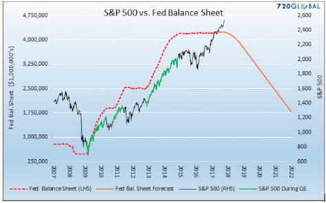
As the above graph makes plainly clear, where Fed steroids go (i.e. QE/money printing and low rates) the markets go. It’s just that simple. Period.
Thus, if the Fed support, as proposed, goes down (as the Fed projections warn) rather than up, guess where the markets are heading?
Simply stated: The Fed plans to shift from being a drug-pusher (Quantitative “Easer”) to a last-minute drug-counselor (Quantitative Tightener) –i.e. it’s taking away the market’s punch bowl.
Is this because the FMOC has suddenly been struck with a conscience, wisdom or moment of sobriety?
Nope.
They just know that a recession is coming—so they have to reduce their balance sheet and raise rates as coyly and quickly as possible to at least have some kind of interest rate to cut (or balance sheet to expand) in the next meltdown—a meltdown of which they are 100% responsible…
The ironies just abound. Relying on the visible hands of the Fed (rather than invisible hands of supply and demand) to manage $20T+ of market complexity, is akin to relying on a team of sailors to manage the Atlantic Ocean. It’s pure hubris (and naïveté of the highest order).
As my piece on Quantitative Tightening (QT) shows, the Fed has a schedule to keep. If they actually keep it—there’s volatility ahead.
As markets get this drunk, stupidity kicks in and fear of hangovers naturally diminishes. The same is true of volatility.
The other screaming sign of crazy in today’s bloated risk market is the record low “fear index” aka the VIX, or volatility index, of which I’ve touched upon here and here…
What’s amazing about this index? Let us count the ways…
First, whenever the VIX sinks to such lows, the long volatility trade becomes the last good value buy in a market otherwise lacking in rock-bottom value trades. In other words: whenever the masses say there’s nothing to fear—that’s precisely when you know volatility is coming.
Secondly, because there are so many financial products (concocted by a sell-side gone wild) whose instruments are directly tied to the VIX, this dramatically increases the speed and depth of a “flash crash” ala 1987.
That is, with the VIX so low (thanks to Fed “bubble support”), the cost of buying protection from a volatility spike has never been cheaper. But the premium-collecting little piggies in the straw and mud houses selling such cheap insurance/protection (as they have no fear of a big bad market wolf) may not be able to deliver this protection when the wolf comes a huffing and a puffing.
Just as AIG couldn’t pay the CDS insurance on the crashing subprime/ABS trade back in 08, today’s volatility sellers are unlikely to have the contracts and cash to pay out their VIX insurance…In short, and like AIG, they will be good at collecting premiums but bad at paying out claims…
As hedgers, ETP sponsors and dealers in the brick houses inevitably pile up to collect their VIX insurance, the Vol sellers (i.e. insurance guys) will be forced to purchase their VIX futures contracts to make good. But consider this, if these fantasy markets were to drop by so much as 5% (a prospect almost foreign to the Fed-drunk investors of today), this would force the sale of over 400,000+ VIX futures contracts in a matter of minutes.
And voilla! What was once a “hedging insurance product” will quickly morph into a liquidity crisis and panic accelerator? We’ve seen this movie before…
As said elsewhere, every market crisis is a liquidity crisis which follows a debt crisis. If the VIX contracts don’t alarm you, perhaps the junk bond market numbers will. As I’ve written ad nausea, the bond market, bloated by over 30 years of low rate policy at the FED, is the biggest bubble of all.
When someone yells “fire” in this tinder-box heater, there will be no bid—i.e. no exit door—as covenant-lite junk paper begins its defaulting firestorm into the history books. I can’t over-emphasize enough the risk these bond markets face—and the spillover effect they will have in the equity markets as well.
Again the evidence is here, here and here…
So please, please, please—keep your eye on the yield curve in general and the 10 year UST in particular.
Hopefully the above 3 graphs and our little foray into the VIX and bond bubble will help you think a little differently (and more) about risk than the poor herd currently going all-in at the very top of the market.
Whether this market corrects in a week, month or year is not the right question—the idea of emptying your cash reserves and taking on all-in risk at these levels is beyond imprudent.
I’ve written about the difference between risk and uncertainty. The former can be measured, the latter cannot. This blog—and the pictures above—give you ample evidence of the measurable risks these markets face, so there’s no excuse if you’re caught trying to find an exit door when the theater catches fire.
Each of you/us must decide how much cash you/we want to keep on the sidelines in this environment of exuberance and euphoric highs. For long-only investors caught up in the euphoria of recent highs, the risks far outweigh the reward; and yet, it’s hard to think about that when the tickers are green…
It’s tempting to think you’ll time your exit just right, or that these markets will just ride higher and higher than expected, like Trump’s mockery of the pre-election polls.
Who knows? Maybe the nonsense can continue longer than it should—but it’s still nonsense.
We at Signals Matter spend a lot of time and data looking for (and at) exit signs, and yet even we know that no one can perfectly predict or time a market slide, least of all the Fed. Caution and common sense, with a little help from our Bloomberg terminals and experience, is needed now more than ever.
Be careful out there. Trade according to your own risk tolerance and interpretation of the signs—but please, at least look at the signs—almost no one else is –and certainly not the talking heads…
Clear, informative, helpful.
Pretty scary, but very informative and to the point. Hard to disagree, but hard to look at.