My good friend, John C., once told me that no matter how sophisticated one’s understanding or investment convictions, they would be of no use if one could not reduce them to 3 market graphs and a crayon.
Well Johny boy, I have no crayon font, but here are those three market graphs.
Three Market Graphs
Today I wanted to share 3 basic market graphs and allow them to simply speak for themselves.
In sum, this report is intended to be very short, but not so sweet.
Market Graph No. 1: I Told You So
In prior reports I warned that whatever crisis were to next hit our economy, be it a virus, war or bank failure, that the Fed would unleash extreme money printing, as it always has, and always does.
Well, unlimited QE ensued, and this is what money-printing gone wild looks like (note the needle peak to the right…):
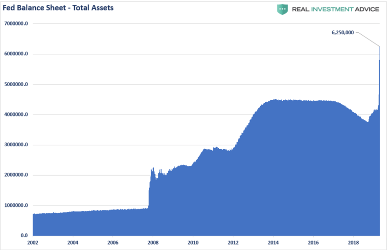
Mark my words: There will be much more printing to come.
And if you think unlimited QE is a real solution, simply consider another prescient report I warned/penned well before COVID-19 here. Again, for those in the know, the response we are seeing, though beyond even my expectations of crazy, is at least no surprise here.
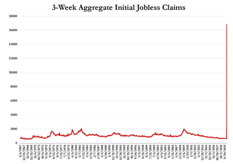
Market Graph No. 2: Main Street Screwed
I’ve also shown with evidence rather than rancor in two prior reports here and here that the Fed favors Wall Street and bond markets far more than the real economy, despite headline efforts to tell the masses to “be calm and carry on.”
Are any of you really buying that meme?
And if you think the rigged-to-fail system between Wall Street and Washington DC, now working in overdrive, is “saving” Main Street, please consider this second market graph as we head toward a month-end unemployment figure poised to reach 30 million:
Market Graph No.3: The Suckers Are Being Sucked “All-In” at the Very Worst Time
Even if this crisis were to magically disappear in the next five seconds, the time it would take for earnings, employment and markets to suddenly achieve a V-shaped recovery and then sustain itself, would be long not short.
But most of us informed investors already know that: A) this crisis will not disappear in five seconds and, B) markets have not even come close to hitting their lows.
One would thus assume that investors understand this and are thus managing risk rather fantasy and following the sound (as well as common sense) advice to avoid further losses, exit risky (rigged) markets, allocate to the right sectors now and wait for a valuable bottom to go “all-in” rather than hope for a miraculous top.
Instead, the majority of retail investors are being advised to stay the course, bite a stick and hope for the best.
Unfortunately, hope is not an investment plan.
At this historical inflection point of uncertainty and risk, the majority of investors (as usual) are wrong and came into this crisis with the ratio of their household stock holdings at twice the size of their disposable income—the highest level of risk and exposure ever seen.
Hard to believe? See for yourself:
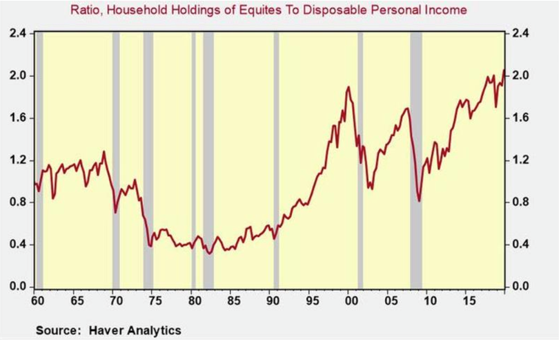
In short, traditional advisors have charmed their clients and retail investors (as always) into assuming the highest level of exposure just before the highest levels of risk hit our markets.
Why? Because most advisors think alike, and thus badly.
If you still think and hope that traditional investing works, that’s a critical mistake.
Fortunately, our subscribers knew better, and have been protecting and making money rather than risking (and hence losing) it during these unprecedented times.
Time to Get Real
Are YOU ready to replace hope with facts, and bad advice with real financial advice?
If so, subscribe here.
It’s just that blunt and just that simple.
See you on the other (subscriber’s) side.
Tom and Matt
Matt/Tom, you should look for a chart that overlays the Federal Reserve Balance Sheet with the S&P 500. Historically, there is a very high correlation, but my feeling is that general inflation will far outrun the price gains in financial assets, so in real terms an investor will lose money vs the broader inflation. For example, lets say inflation goes up 300% in a year, but S&P 500 and home values only go up by 60%. In purchasing power terms the equity and RE holdings got crushed. That’s the way I see it. Oh and by the way, food prices will be 1000%. So the poor and working classes will pay that way. The inflation tax!