
Below, we look at the one market chart that explains everything. I ask that you read this lengthy piece to the very end. Lots of time in airplanes has allowed my paragraphs to stretch a bit.
Maybe read it twice, and then, well… once more after that. Please, feel free as well to fact-check the math. Thereafter, the simple will rise from the unnecessarily complex, and all of us will be on the same—as well as sane—side of market reality.
Clarity with a Sting
It is said that those who don’t understand history are effectively doomed to repeat it.
As an American spending a great deal of time personally and professionally outside of America, the frequent opportunity to get an “ex-pat’s” perspective on the United States is sometimes both a blessing and a curse.
That is, one can often learn more about their country (and themselves) from outside one’s native borders. This knowledge—even clarity—is not always discernable to those who get their “news” exclusively from inside their borders.
This clarity, moreover, can be painful. As the one market chart that explains everything (see below) suggests, knowledge is power—but it also comes with a sobering sting, as well shall discover together.
Furthermore, when one considers how low the bar has fallen in the “Fourth Estate” of the US Main Stream Media–on everything from the war in Syria to the deeper reality of the US economy—it’s not uncommon today (sadly) for discerning Americans to seek their news elsewhere.
This search for data can stretch as far away as Australia, where braver journalists like Philip Knightley or Tim Anderson can tell you far more about US foreign policy in the Middle East, for example, than anything we can get from the left or right wing drivel masquerading as “news” coming out of DC.
Objective Truth and US Debt
As I recently wrote in the otherwise odd and relatively apolitical/innocuous context of TESLA’s balance sheet lies, there is such a thing as “objective truth” as opposed to just partisan propaganda, opinion-ranting or Wall Street cheerleading—the three legs of the current “information stool” that is American “journalism.”
Take the issue of US debt. Like real employment, GDP, earnings, or inflation, it’s not only under-reported, it’s miss-reported. And below I’ll show you why and how in one simple chart.
And what better place to consider this topic than from outside the US? And to add an extra ironic spice to the mix, what better venue than Istanbul, the center of debt-ravaged Turkey, to consider debt-ravaged America?
After all, US pundits continually remind us of how financially messed up Turkey has become as a country.
There’s almost a condescending tone to our Western reporting, similar to the manner in which we showed an equally arrogant (yet valid) dismay for Greece in allowing itself to get over its skis in astronomical debt.
And the facts–objective facts—confirm this. For example, Turkey’s LIRA has fallen by more than 50% against the USD (makes it easier/cheaper for Americans here…), interest rates are rising, and a debt storm is already blowing through its headlines.
Conversations with the local Turks—be they waiters or bankers—confirms the depths of Turkey’s unease, which has many layers, from the ongoing threats and rumors of war, trade wars and the suffocating implications of its debt burden to the endless corruption of Turkish politics.
Rumors of war? Suffocating debt? Trade wars? Corrupt politicians?
Sound familiar?
For here’s the rub: Turkey and the United States (and for that matter, the EU, Japan, China and pretty much the rest of this fragile globe) share similar distortions, and ultimately similar fates, namely: a debt time bomb.
The Clock Is Ticking
I recently shot an in informal video from Arlington National Cemetery touching upon the economic costs of the US Warfare State. In that ad-hoc report, I promised to post a chart that put the entire US debt discussion into simple perspective.
So, let’s keep that promise, roll up our sleeves and put this debt mystery to bed once and for all, shall we?
First: here’s the chart:
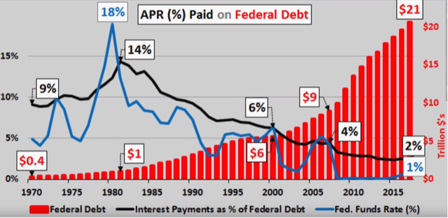
Initially, it may seem like a lot of confusing colors, bars and gyrating lines. But in fact, this single chart will help guide us through the fog of any and all future discussions and debates about fiscal politics, interest rates and debt in the US.
Furthermore, this chart, which we examine in more detail below, will clarify the inevitability (and crushing scope) of our next recession.
As I said in the Arlington Video, as well as in the Bond Wave video just a week prior, the United States public debt, currently at $21 Trillion and counting, is a staggering number.
More to the point, it’s a crushing number, and will, for the record, destroy the US economy for many, many years to come as it takes away all (and much more) of the gains of the so-called “recovery” which Bernanke, Paulson, Geithner et all gave us in the rubble of the 2008 financial crisis.
How do I know this?
Simple: it comes down to two subjects that most of our bubble-head anchormen and financial pundits must have over-looked in their marketing and advertising classes, namely MATH and HISTORY.
History—and Insanity
Let’s start with history. As I wrote in a four-part, Market History series last August, a country in debt cannot solve a debt problem by taking on more debt.
Sounds like common sense, no?
But if insanity is defined as doing the same thing over and over yet expecting a different result, then the political and fiscal policies of the US since the crash of 1929 in general, and the 08-crisis in particular, has been a chilling case study in, well: insanity.
Without unpacking all of the empirical data set forth in my four-part Market History series, the underlying theme, however, is worth repeating.
That is, a country in a debt crisis cannot borrow its way out of debt, nor can it print its way out of debt.
It can only grow its way out of debt.
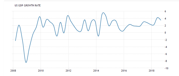
And guess what? Since 2008, we’ve printed and borrowed like drunken gangbusters, but we didn’t grow. In fact, our much-heralded GDP growth is a gyrating fish on a dock, not a phoenix rising…
In short, the “great QE experiment” of 08 has been an unequivocal failure—it rescued Wall Street but did nothing to grow our productive economy.
In the happy fog of rising markets and increasingly dumb journalism, however, this slow lie has gone un-noticed.
That is, the US has been borrowing ($21T) and printing ($4T) at levels never seen before. Unfortunately, and despite all the media and political spin to the contrary, we did not accomplish the one thing that could have saved us: steady economic growth.
Instead, we just saw the stock markets inflate to levels beyond reason.
Most pundits, however, think the stock market is the measure of an economy; then again, most pundits know very little about markets or the economy.
Despite all the recent hoopla about low unemployment and back-to-back quarters of rising GDP, actual US economic growth since the 08-crisis has been flat, with annual GDP stagnating at average rate of 2% since 2008.
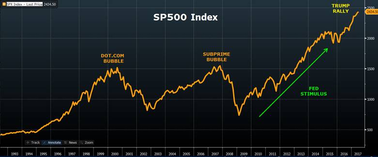
Of course, while US GDP stagnated in the last decade, the NASDAQ rose by 200%. The S&P and DOW skyrocketed as well—and I mean to the moon. The market images below speak for themselves.
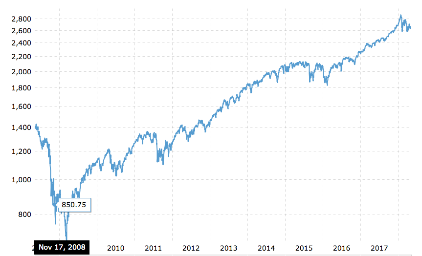
And if you still think the current market is not a bubble, it’s worth noting that today’s S&P is already 50% higher into bubble territory than the pre-08 bubble, and even loftier than the dot.com bubble of 2001:
Money-Printing and Rate Manipulation: The “Cure” that Eventually Kills
So, it’s clear to see that when the US Federal Reserve and Treasury Department bailed out the very TBTF banks that once employed them, they achieved this “noble fraud” by printing money and borrowing trillions at Fed-manipulated low rates (i.e. “Quantitative Easing”).
The now obvious and undeniable result was not a “rescued economy” but a cancerous and historically unprecedented market bubble—and one which will soon pop (see below) in history-making fashion confirmed by the sobering yet predictable sting of honest math.
Stated otherwise (and confirmed by the smartest guys in the room, from Nassim Taleb to Papa Smurf) structural problems (i.e. debt) cannot be solved by monetary policy (i.e. 10+ years of central bank money printing and interest rate suppression).
Can-Kicking a Private Debt Crisis to a Public Debt Bubble = A Bigger Crisis Tomorrow
In 2008, we had a private debt crisis (i.e. individual, “D-” sub-prime real estate debt), which banks then attempted to package as “A+” asset-backed securities and whose internal rot spread within, leading, ironically, to the destruction of the very (leveraged) banks (and markets) who syndicated them.
After 08, rather than jail or fine the heads of those private and money-drunk banks, the US saved their butts…
That is, we bailed out the very foxes who raided the US economic henhouse. This historically shameful measure (nod to Paulson, Geithner and Bernanke) was achieved via astronomical money printing at The Fed and astronomical borrowing at the US Treasury Department.
In short, we “solved” the private debt crisis of 08 by simply transferring the debt from the private sector to the US Government (i.e. to you, the soon-to-be whip-sawed tax-payer).
This “solution” of solving a private debt crisis by creating a governmental debt crisis/bubble has never, not ever, not once, ever, ever, ever, and I mean not ever worked (!) in the entire history of markets, from John Law or 1791 France to 1917 Imperial Russia to 2018 Imperial America.
Period, full stop.
Of course, right now, as we bask in the dying glow of the current (yet unsustainable) debt bubble which bailed us out of the last one, the debt-driven market party rages and markets, addicted to low-rate debt, thrive as common sense and prudent risk management have left the building.
And that folks, is where we are now. In the “dumb, drunk and dangerous” phase of a market bubble. History confirms this—from the dot.com stupidity of 2001, the Nikkei bubble of 1989 or the sub-prime insanity of 2008. Markets get drunk, high and cocky just before they puke.
Only this time, it’s infinitely worse; our debt is too big, our central bank too stretched, and our politics too divided. When this current market euphoria begins its “hangover phase,” there won’t be any tools left in the Fed’s “print & borrow” toolbox to save the markets or your portfolio.
There will be no V-shaped recovery. Instead, your portfolio will get slammed and stay that way for years…
So that’s the history lesson.
But as the lessons of love, markets or even philosophy confirm: what good does knowing do with no one to show it to?
That is, how can we use and share our knowledge and experience?
And how can we know when and how it all ends?
Well, to answer this, we have to shift from the lessons of history to the guidance of math. Which means we finally get to look at the one chart that explains everything.
Math—And How We Temporarily Got Away with a Debt Orgy
Let’s keep this very simple: Low-rate debt gave us the post-08 “everything bubble” (from the stock markets to Real Estate), and Rising-rates are going to kill this bubble. Period.
Now, let’s combine history with basic math to show how horribly this is gonna play out in the next 2 years.
When the ex-bankers who became policy makers in the rubble of the 08-disaster (aka the “Great Recession”) got together to “solve” the US sub-prime debt crisis, they did so by putting the US on another debt-binge.
Brilliant.
Debt Without Tears—So Far At Least…
As one look at our national accounting confirms, the US (i.e. DC in cahoots with Wall Street) went mad, taking on more debt in a decade than we had in the previous (cumulative and inflation-adjusted) 250+ years of our entire history.
Debt, in short saved us. Having gone from $900 Billion of Federal debt in 1980 to $21 TRILLION and counting today, we borrowed our way to market glory and Main Street lethargy.
But guess what? It worked.
Huh?
Yep. The post-08 debt orgy actually worked! We took our public, private and corporate debt levels ($70 Trillion and counting) to the moon and beyond, and it hasn’t hurt us one bit at the national pain level.
So far, we got away with it: debt without tears! And the sky-rocketing markets (and CEO salaries backed by earnings, clever accounting and shipping labor and manufacturing to the third world) made America great, and the top 1-10% of our wealthiest citizens even richer.
Success! Joy! The best of times!
Well, yes…at least in the short term.
Drumroll the Tears…And the One Market Chart that Explains Everything
But here’s the unspoken, dirty little secret…here’s the hidden and lethal cancer lurking beneath our “recovery” and mathematically certain to kill the US economy:
Debt works when the cost of borrowing (i.e. interest rates) is 0-2%, BUT debt destroys when the cost of borrowing spikes.
And folks, the cost of borrowing is about to spike.
So, we return, again, to the chart that explains everything:
Understanding the Chart that Explains Everything
As you can see from the rising columns of red bars, US public debt has gone off the charts of normal and deep into full-on crazy-land.
So why didn’t this debt kill us?
Simple: look at that cute little blue line.
That blue line represents the interest rate set by our genius bankers at The Federal Reserve on Constitutional Ave—a central private bank, by the way, that is neither Federal nor Constitutional.
The ironies do abound…
As you can see in this chart, when the central bank artificially crams interest rates (the “blue-line” cost of borrowing) to near zero for years, the actual interest expense (i.e. the “black-line” amount America has to pay to service that debt) is almost painless.
Which brings us to the sneaky little black line on this extraordinary chart. You see, the black line represents the actual “interest expense on debt” that America has to pay back.
In simplest terms, this little black line essentially boils down to our “Pain Line.”
That is, the lower that black line, the lower the “pain,” or cost, of paying for our debt. Obviously, this “Pain Line” goes up and down as the blue line (i.e. the Fed-Funds interest rate) goes up and down.
What’s fascinating (and abundantly clear) in this chart, is that a country can actually have massive debt levels (as represented by the red bars) yet very little interest expense “pain” (as represented by the sloping black line) so long as interest rates (the blue line) are low.
In fact, if you look at this infamous chart, you can see that America is suffering less interest expense “pain” at $21 Trillion in debt then we suffered back in the 70’s and 80’s when our national debt was well below $1 Trillion.
Why? Because in the 70’s and 80’s interest rates were between 18% and 9%. Ouch. Lots of pain then.
As this chart makes so incredibly clear (and simple): the key to national pain (i.e. interest payments as a percentage of federal debt) hinges directly on the interest rate of our debt.
What is equally clear is that when interest rates are artificially crammed to the floor (think post-08), a country’s debt level can reach absurd levels (20X where they were in the 80’s) with no (in fact, even less) immediate (i.e. painful) interest-expense consequence.
And so, you might be tempted to say, wow, that’s great. As long as The Fed keeps rates (the “blue-line’) low, we can basically borrow into infinity and beyond without having to suffer any interest-expense (i.e. “black-line’) pain.
In short, some of you might believe The Fed can save us. The Fed is all-powerful and wise. The Fed knows what it’s doing and has our back. Low rates are all it takes, and The Fed can dial them down like a thermostat that controls economic weather as effectively as the temperature gauge in one’s home.
Unfortunately, most of us recognize that despite their hubris and arrogance, in the long term, The Fed cannot control interest rates any more than a seasoned sailor or surfer can control the ocean.
Why?
Because, and as discussed countless times: it is the bond market, and not The Fed, which ultimately decides interest rates.
This harsh fact is something the bubbleheads in the media, the financial sell-side, and the talking-head morons (red and blue) in DC aren’t telling you.
Most sailors and surfers, for example, have a humble and healthy respect for the power of the ocean and the forces of nature.
DC, Wall Street, media spinners and The Fed, however, have lost such respect for the power of the markets and the forces of supply and demand. As result, a totally unsuspecting America is about to drown in quietly rising rates and a tanking market and economy.
It’s shameful. But more to the point, it portends disaster. And this disaster is as easy to see (for those who know bond markets) as a storm cloud approaching the coast.
And returning to the one market chart that explains everything, imagine the absolute carnage and pain (a rising black-line) that will come to the US economy, the US markets and the average retirement or 401K account when those rising red bars ($21T of debt) collide with rising rates?
That is: imagine what happens when the black “pain line” of interest expense inevitably rises (along with interest rates) to levels we saw back in the 80’s or 90’s—you know, that era before Greenspan sold the Federal Reserve’s soul to Wall Street.
Well, I’ll tell you what happens: the US will suffer the greatest economic collapse and recession in its history.
Math not Drama
Does that sound too “gloom and doom”? Is that just me “selling fear” and spreading crazy to make an exaggerated point?
Nope.
That’s me telling you what most of us hedge fund veterans and bond traders already know (and quietly discuss) amongst ourselves.
But now, I’m telling YOU.
Why?
Because it’s the right thing to do.
If one sees smoke in a crowded theater, it’s natural to shout “fire!” To do otherwise is an insult to one’s conscience, and my conscience, as well as conviction as to the coming fire in our economy and markets, is 100%.
The inevitability and certainty of rising rates and thus an historical market crash is no longer a prediction or hypothetical debate. It’s the unspoken secret on Wall Street’s elite credit desks.
The objective truth of this coming yield-spike (interest rate cancer) is proven not by “gloom and doom” grandstanding or financial-blog fear-mongering.
Nope.
The certainty of the coming financial collapse is proven by MATH.
Let me explain. Interest rates go up when bond prices go down.
Furthermore, the market forces of supply and demand in the bond market, and not egos at The Federal Reserve, ultimately determine interest rates.
That is, when more and more bonds enter the credit markets, the price of those bonds goes down, and thus the yield (and interest rates) for those bonds goes up.
Read that last line again.
Shark Fins Approaching
Starting in October, the Fed began selling $600B of bonds into the market. Far more dangerous, however, is the fact that the US government is about dump a at least $1 Trillion more of US bonds into the supply pool.
Why?
Because the US has no choice in 2019 but to borrow more money to pay for our tax cuts, our endless war on terror, our trade war, our DC bureaucracy, our rising state and Federal expenses, our infrastructure requirements, our immigration wall, our massive and bloated, post-9-11 intel complex etc.
This means we have to issue lots and lots of new bonds (i.e.10-year Treasuries) into the open market to cover our borrowing needs. (At 2% average GDP growth since 08, the US no longer produces enough income as a country to pay our bills, so now we just keep borrowing…)
The amount of bonds the US Government will thus be dumping into the credit markets in 2019 will be at least $1.2 Trillion.
Add to that number the $600B which the Federal Reserve is now dumping, and we get the mathematical reality of higher bond supply, which means lower bond prices, which means higher bond yields, which means higher interest rates.
And as the chart above makes clear, higher interest rates means higher interest expense pain (the “blackline”)—and higher interest rate pain means the end of the bubble party in DC and Wall Street.
Think about it: At roughly $380B per year (!) just to pay interest on our national debt at 2% rates, imagine what that national interest payment/pain becomes when rates go to 4%? To 6%?
And it will happen.
Nothing and no one can stop the inevitable power of market forces and basic supply and demand. No one can stop the flow of bonds coming into the open market from a country that has no choice but to borrow, which means no one can stop interest rates from rising and the US economy and stock markets from tanking.
Of course, after the 2008 crisis, The Fed, in the short-term, was able to temporarily manipulate and control bond supply and demand by printing trillions of dollars out of thin air to buy US bonds.
In doing so, the central bank artificially kept bond prices up by buying US bonds—i.e. drinking our own sovereign debt Kool-aide. By doing so, the central bank was able to keep bond yields (and thus interest rates) artificially down.
But this Band-Aid fix cannot last forever.
If the central bank tries to keep bond yields/interest rates down by printing trillions more dollars in the future (i.e. more desperate QE), they can perhaps buy a bit more time, but that’s it. Furthermore, printing more money just means further currency destruction.
Thus, either 1) the central bank artificially prints more money (and they will if markets tank by 20% or more) and pushes us toward an inflationary death trap, or 2) the bond market naturally sends rates up and the economy into the basement.
We are now between an inflationary “rock” and interest-rate “hard place.”
Inflation and Recession, or worse yet, inflation and a recession (stagflation). Today, those are the only choices facing the US.
And we got here because rather than take our lumps in 08 and suffer the consequences of our banking and mortgage debt sins then, our central bank (Wall Street’s mistress) merely postponed the pain—and by doing so only made the cost of our redemption infinitely worse for tomorrow.
The Bigger the Debt, the Bigger the Crash
As I (and the Austrian School of economics) reminded us back in December of 2017, the bigger the debt party (from corporate stock buy-backs and cheap mortgages to national deficits), the bigger the recession that follows.
The public debt levels shown in the chart above defy all historical precedent, which means the recession to follow will be equally unprecedented.
Again, this is just history and math folks, not “gloom and doom” market timing or blog bravado.
Our Mission—Shark Warning and a Bang-Stick Plan
We at Signals Matter loved, served and defended our country. But at debt levels such as these (and policies such as those handed to us from bankers like Paulson or egos like Bernanke), we don’t entirely feel our country is serving us.
Wall Street, of course, was the true beneficiary of the 2008 debt can-kick. But when rising rates sneak up against our debt bubble, nothing about the US markets, economy or society will be the same.
We created Signals Matter so that more and more of you will have the information, tools and plans in place to prepare for (rather than desperately react to) the dangers ahead.
Currently, we are designing a tool for our subscribers which tracks the distance of this coming interest-rate shark to their retirement accounts and/or portfolios.
We intend to protect as many investors and hard-working Americans (of all income and investment levels) from the approaching dorsal fins with a bang-stick—that is, a plan to ward off the approaching shark.
Until then, and as always, be careful out there. Those interest rate fins are in full site and already beginning to circle unprepared investors.