Market charts, like market facts, can speak a thousand words.
With the weekend approaching and all our minds tired of political headlines and perpetual squawking, I thought I’d spare you some of my perpetual market squawking as well.
The Financial World in Pictures
Despite rising bond and stock prices defying all economic and valuation norms, many still feel strangely safe and complacent in the new fantasy zone of Fed supported markets.
Week after week, I bombard our readers with bemused prose as I look upon objective data which defies market moves by the second.
Thereafter, I shake my head before you with often long and link-heavy reports that can tire the eyes as I warn of otherwise ignored systemic risks that are no fun at a dinner party—to the extent those even exist anymore…
Thus, rather than walk through my words, I thought we’d walk through some basic market charts which pretty much confirm that things really are a Twilight Zone out there, and thus worth a second, third, and even fourth thought as to making sure your portfolios are prepared for reality not fantasy.
OK, let’s dig in and take a gander at some key market charts…
A Stock Bubble, Pure and Simple
I write a lot about equity bubbles and over-valuation. Well, here’s what a stock bubble looks like in real time:
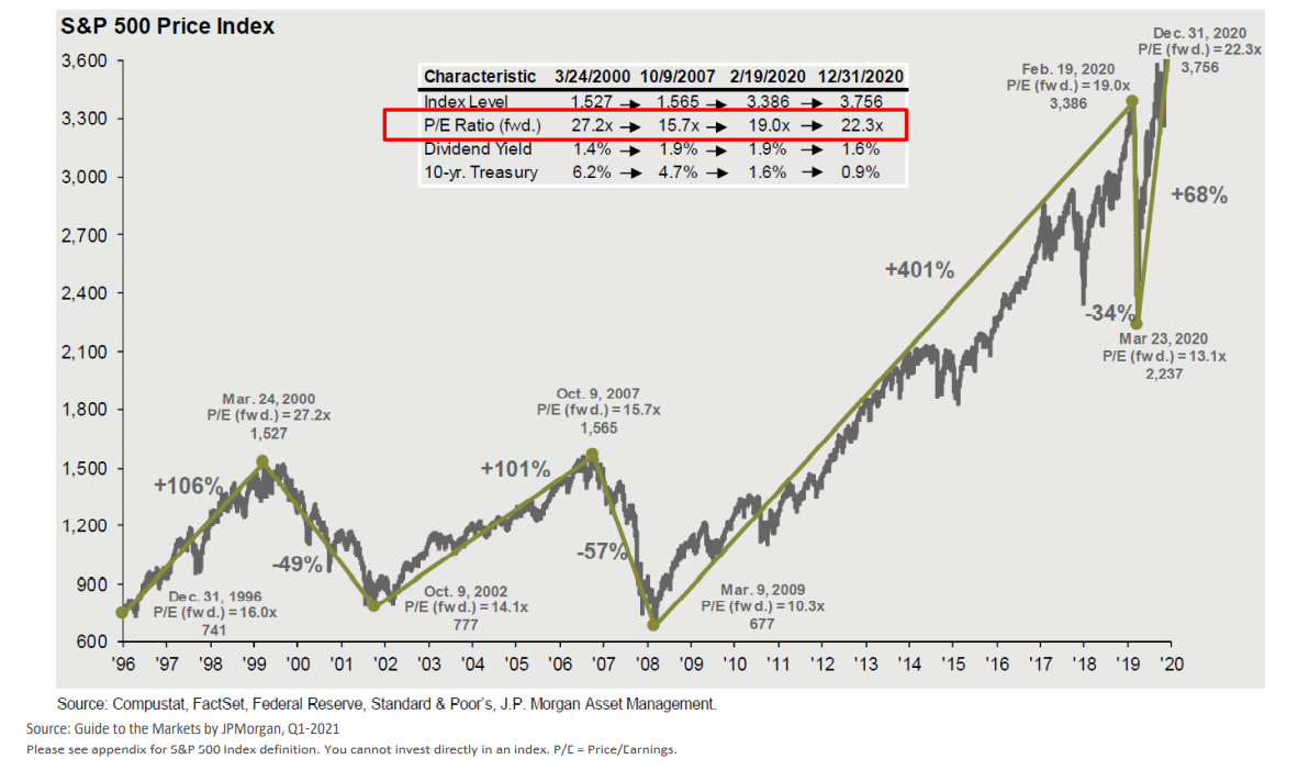
By the way, if you look way down to the left at those two little prior camel bumps (2000 &2008), they represent the Dot.com and Sub-Prime bubbles of yore.
Remember how fun those bubbles were, until they weren’t?
If you like bubbles, then congratulations, the current bubble is a doozy and you’re in one now.
Having traded through prior stock bubbles, I remember well how investors would get all giddy and greedy, chasing small cap names (the market’s “speed boats”) as if growth would never end, and thus ignoring the larger-cap (“Battleships”) stocks as boring relics.
This was true leading up to the dot.com bust in 2000 as well as the sub-prime bust in 08.
And guess what, today’s investors are chasing those same speed boats, as the following chart of mega-cap vs. micro cap stocks confirm:
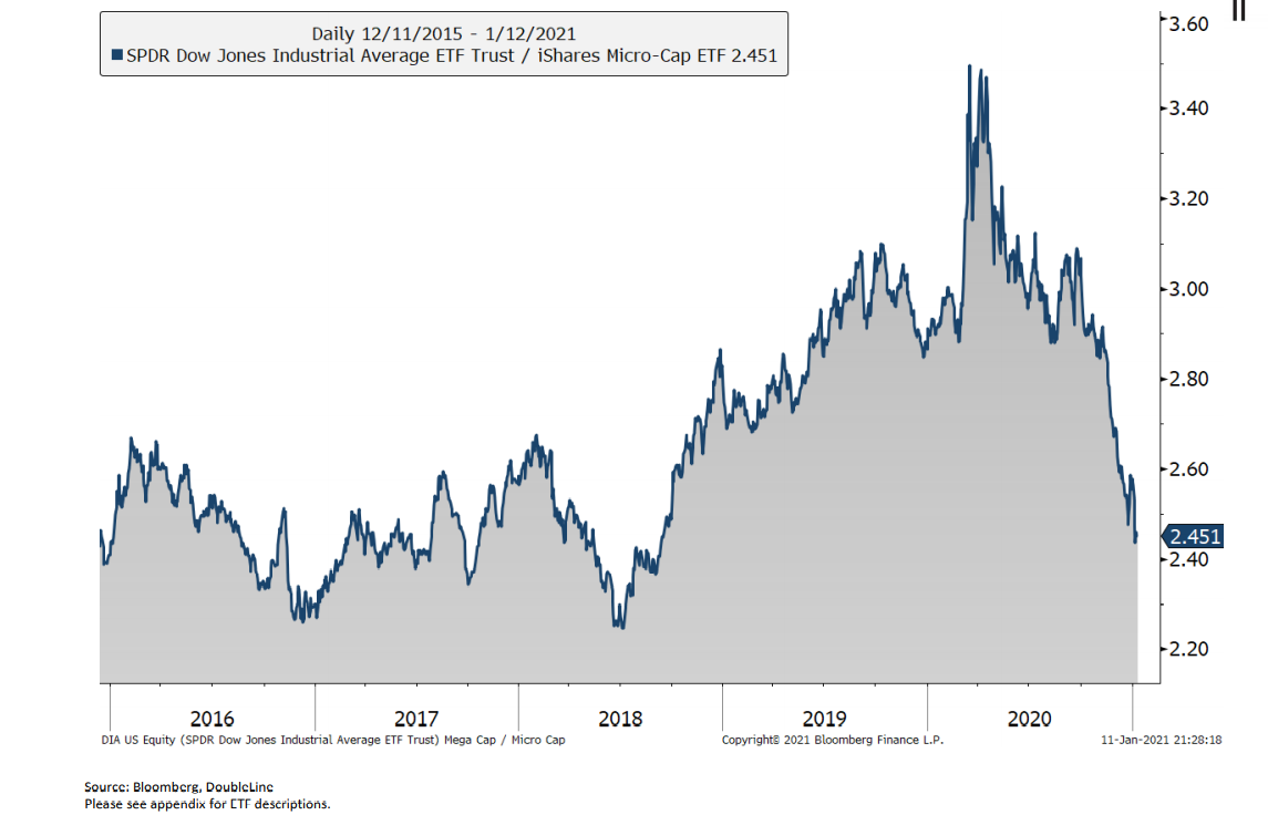
Of course, those buying the smaller-cap “speed boat” stocks are the first to drown when the macro waves catch them tanning on the bow and counting their returns.
For now, alas, no one seems worried about those waves. I’ve seen that movie before too.
Instead, and as I saw in prior bubbles just waiting to eventually pop, the IPO mania (red line below) is back as investors seek solace in projections rather than profits and earnings.
Oh, how history does indeed rhyme…
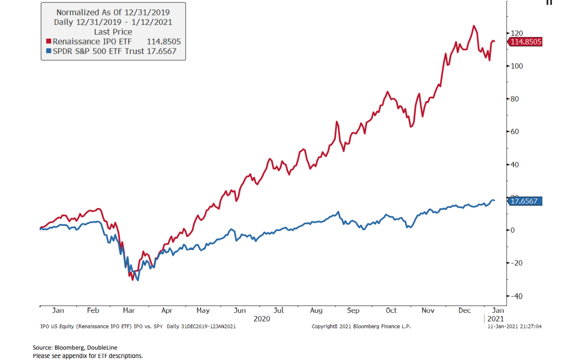
(At least WeWork never made it to full IPO…So there is a market God after all…)
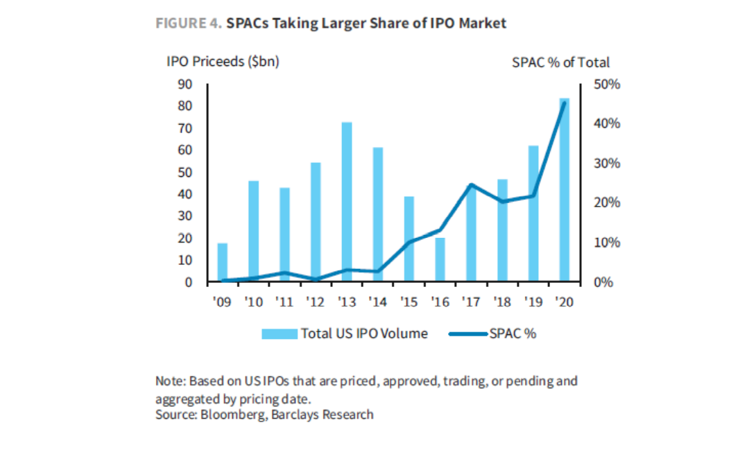
And just like the dot.com bubble of the late 90’s when my classmates were selling IPO’s by the second from fancy offices in San Francisco and NYC, the bulk of today’s profits are being made by the SPACs not the retail sucker’s buying the IPO’s.
For those who don’t know what a “SPAC” or “Special Purpose Acquisition Company” is, they have no commercial purpose and simply raise capital to acquire other companies to pump and then dump them when the prices are right.
Last year, over 50 new SPACs (raising over $21B) were created to make easy money before the macro waves hit.
Yep, I’ve seen this movie of bubbly euphoria before, but in case you still don’t want to face facts (or the SPACs), see for yourself:
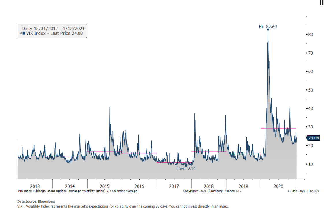
As in prior bubbles traded and endured, I also recall the increasing levels of volatility which preceded each “uh-oh” moment.
The VIX, or “fear indicator” is a convenient way to track these familiar precursors to “Uh-Oh”, and guess what?– the VIX is revealing lots of needle-peak vol signals of trouble ahead (which the Fed will continually try to avoid, so please don’t ask when the crap will hit the fan, I don’t know…):
Bond Bubble Bonkers
But let’s not give all that bubble fun to stocks.
Bonds too are enjoying all kinds of bubbly euphoria.
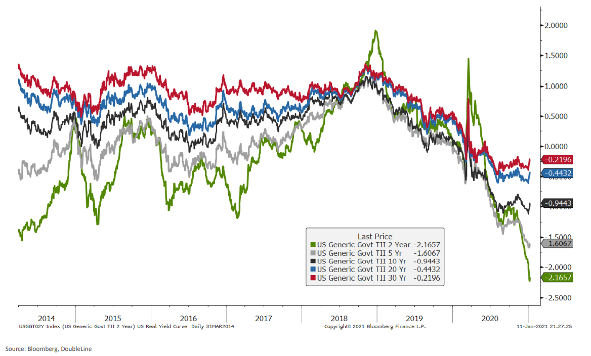
In fact, bonds are so completely and artificially over-bought and price-supported (i.e. “accommodated” or “stimulated”) by the Fed, that their yields (which go down as prices go up) are now negative, making history in an embarrassing manner the likes of which I’ve never seen or studied.
When adjusted for inflation, real yields on all of Uncle Sam’s Treasury bonds pay a negative return, which means they are effectively defaulting bonds and you are paying to lose money when you buy them.
Again, see for yourself:
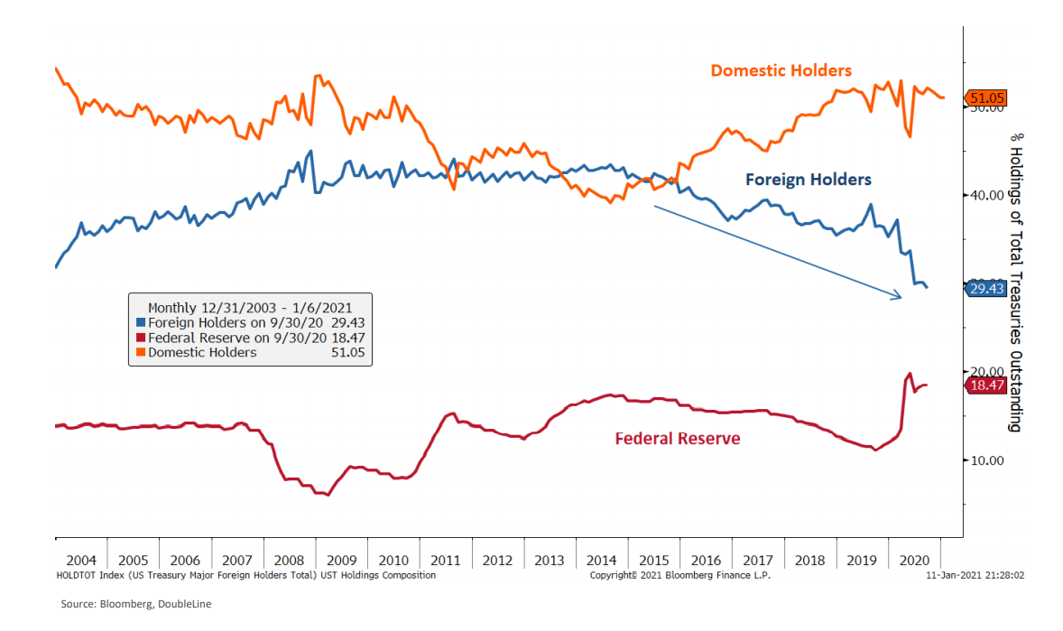
Such an embarrassing lack of yield may explain why more and more foreign buyers are saying “no” to US bonds, leaving the Fed (and your pension funds) left (forced) to buy the rest of these unwanted Treasuries on their island of misfit toys:
But it’s not just Uncle Sam’s bonds that are bubbled to the point of negative yield and national disgrace.
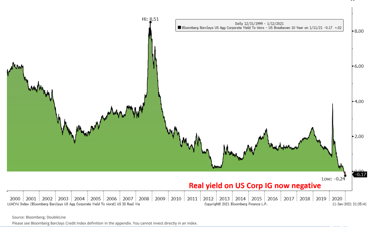
Even that tiny corner of the bloated, sickened and just plain monstrous U.S. corporate bond market designated as “Investment Grade” is offering you a negative real (inflation-adjusted) return.
Really?
Yep.
See for yourself:
Needless to say, bond markets supported by a Fed buyer are not healthy bond markets. In fact, they are dying markets.
This would explain the presence of all those zombie companies (i.e. corporations too broke to make interest payments unless they borrow more) wandering arms stretched-out through Wall Street.
Don’t believe me? Again, see for yourself:
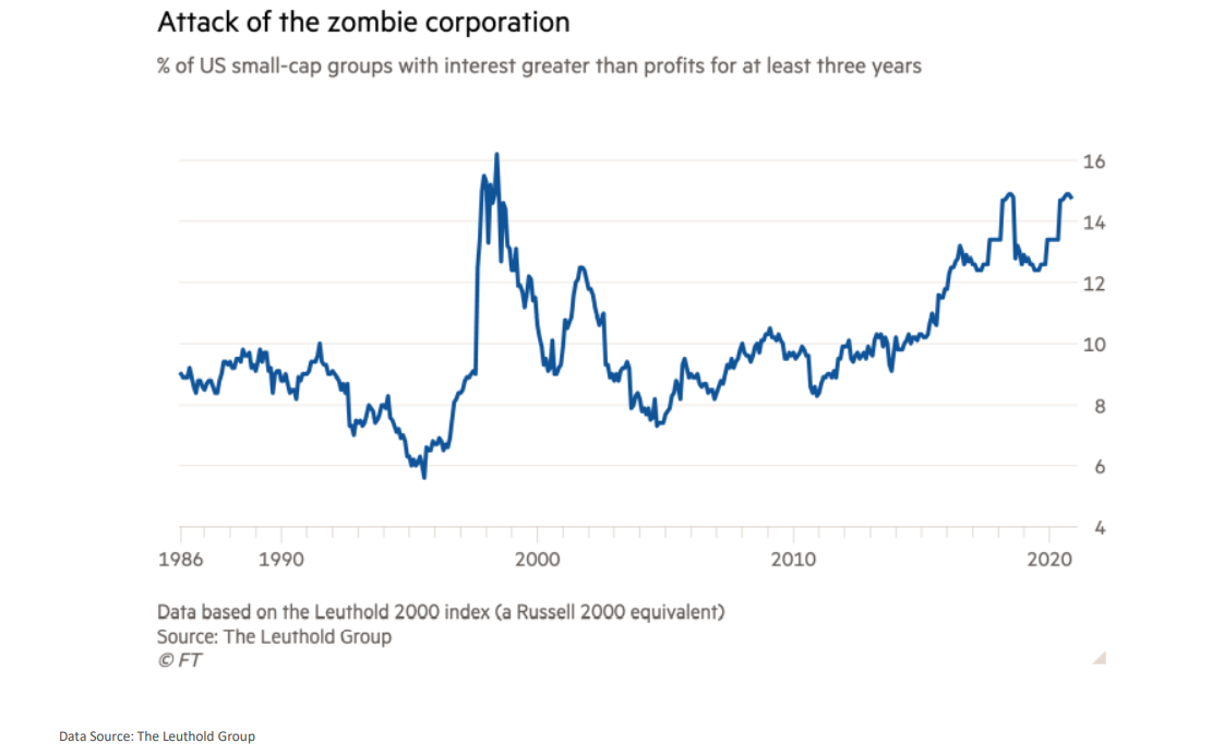
Folks, I swear I’m not making this stuff up. Things really are this crazy.
Speaking of pictorial crazy…
Too Many Fiat Dollars
The Fed, as you know by now, has become the lender and buyer of last resort (at least until the IMF comes into re-set the entire broken system with more broken fantasy).
In the meantime, the Fed will print gobs more US dollars to pay for Uncle Sam’s unwanted IOU’s and just about anything else our debt-soaked country can’t afford.
Other central banks around the world are following the same desperate play book of borrow, print and spend.
This means there’s lots of dollars out there…
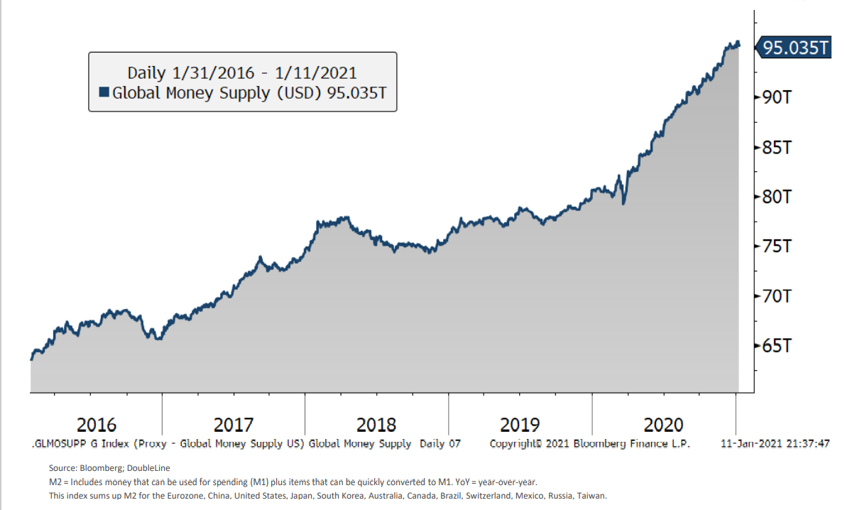
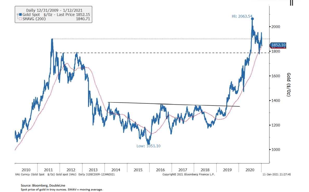
Of course, the more you have of something (from wine to currencies) the less value it has, which means alternative solutions to increasingly debased global fiat currencies are making headlines as well as price moves.
Gold, of course, is my antidote of choice for a fiat world gone mad:
Others, are looking toward Bitcoin to play the fiat-roulette game:
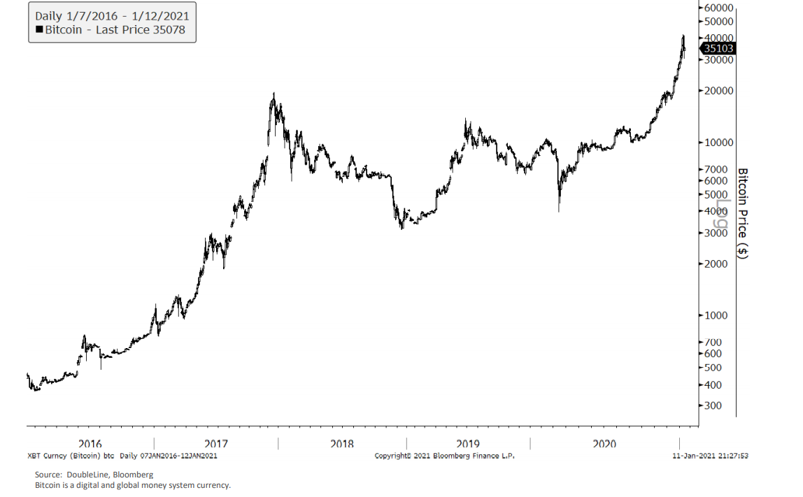
As for the Gold and Bitcoin response to too many fiat dollars, my views on this debate are available here.
By the way…commodities (blue line) in general will be the next value play for patient investors once that S&P bubble (red line) reverts,
Just saying…

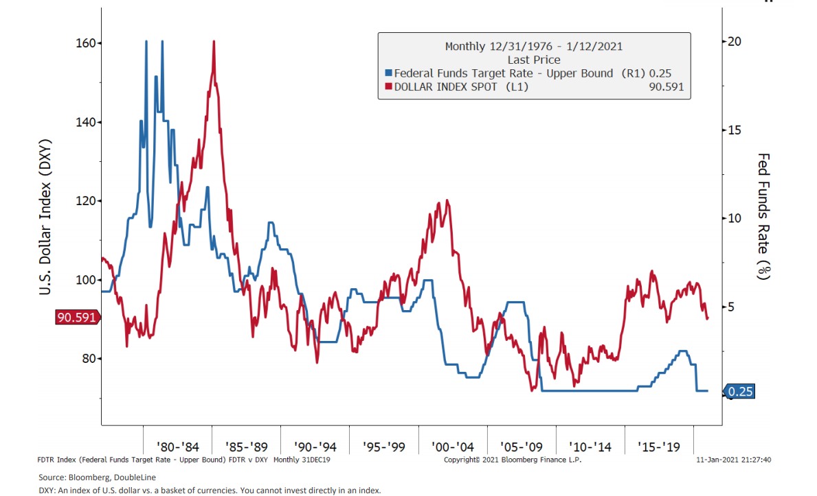
Meanwhile, the U.S. “elites” (ah, the ironies) have backed themselves into such a corner of government debt ($30T and counting) that they have no choice but to artificially repress the cost of that debt (which the blame on COVID not their mirrors) by stappling the Fed Funds Rate to the floor.
Low rates (blue), of course, mean a weaker greenback (red):
Weakness: The New Normal
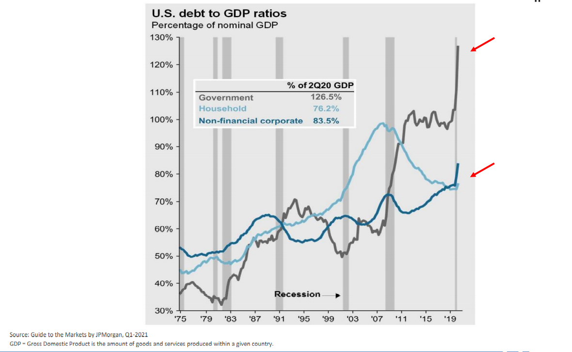
But thanks to years of Fed drunk driving through the highways of Wall Street support and Government debt canyon creation, we can expect no real growth for the real economy, as once debt levels pass a certain ratio of income levels, national growth mathematically tanks.
The current measure of US Debt to US Income (or GDP) is frankly an historical embarrassment, and worth revealing in pictorial rather than poetic imagery…
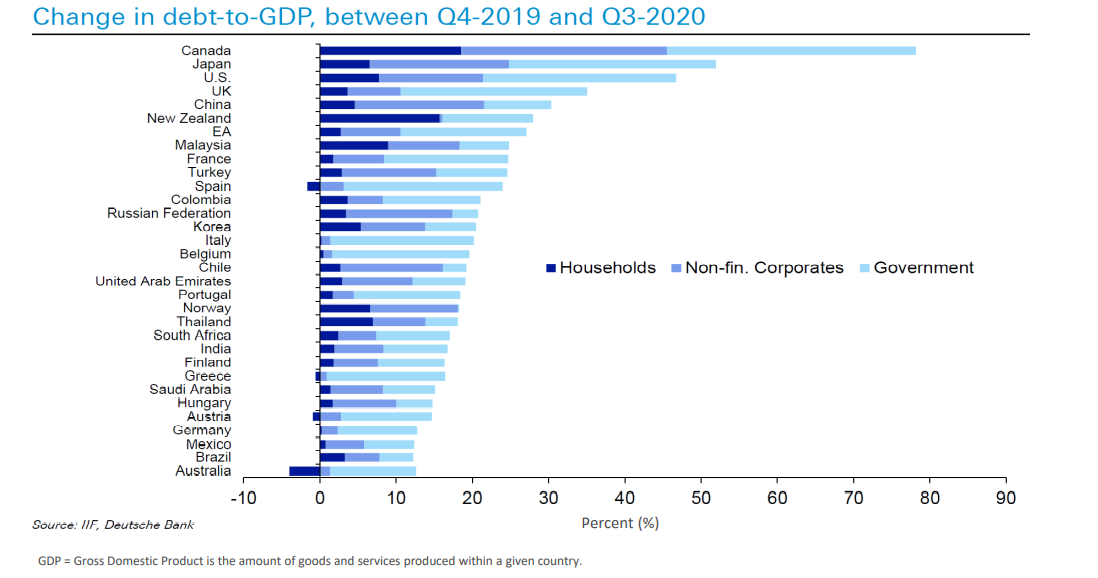
In case you’re feeling patriotic this weekend, let me at least point out that the US is not alone.
Global debt to GDP changes in the wake of policy-maker decisions to shut down their respective economies over COVID have allowed the world, rather than just the U.S., to get deeper into debt and further from growth:
Anyway, that’s a lot to look at, as well as chew on.
As usual, the facts before us are not as fun as the markets rising despite them.
But facts are stubborn things, and deserve some attention, no?
As always, we are here to make sure your portfolio is not caught off guard when these facts and realities get the last say over the current market fantasy.
Click here for more on how we protect you.
Despite these facts, we do wish you a pleasant weekend 😉
Best,
Matt & Tom


With an impending crash, low to no growth, and dollar devaluation looming – where does this leave small to mid size business owners? Is it time to board up the windows and brace for the storm? Or, is there still honest money to be made even though the market has been unhealthily flooded with exuberant amounts of cheap cash.
Fair question Brenden,
Sadly when the Sh!% hits the fan after a Wall Street and Fed-supported orgy, it is typically the small business owners and middle class who suffer the hardest. Even during COVID, as major MNC’s made a killing, 42M Americans were seeking unemployment and small businesses across the nation were shutting their doors (over 3 million, in fact) permanently as names like Tesla, with no FCF, hit record highs or AMZN swallowed up the smaller shops with market-cap power. Whenever and however the next crash manifests, economic growth tanks, and with it, consumer strength and demand, which always impacts small businesses the hardest. Those small shops who survive and have dry powder can seek to grow their businesses by buying out debt-soaked competitors or other business materials at discounts. The key is to move forward with eyes wide open, brace for the headwinds, not over-spend or over-project. Honest money is always rare, but it’s not extinct and will flow toward businesses models with operating income and a real plan for growth in a recessionary backdrop–which is easier said than done.