I like market charts. Sometimes a couple graphs can tell a 1000 words, and so today’s market report will have a word count of just 750. Happy Friday 😉
Less Wall Street Stupid, More Common Sense Simple
Wall Street and its various Bobby Axelrods and complicit Media Wunderkinder like to convince the world of the stock market’s mysterious complexity–a maze otherwise so tangled and a knot otherwise so Gordian that allegedly only the most unique of minds can unravel its sexy, hidden secrets.
But as I’ve learned long ago, just about any strategy (despite a myriad of Greek math) or any market cycle (despite an equal myriad of Fed “duh”) can often be reduced to three graphs and a crayon.
But today is Friday, the sky is bright blue in France and tonight I’m headed to Sarlat to enjoy the setting sun and an equally rising martini, or two…
In short, I’m looking at my watch as well as my Bloomberg screen and will, to your pleasant surprise, actually keep this report short and, hopefully—simple.
Two Market Charts & a Martini
In other words, rather than 3 graphs and a crayon, all we need heading into the weekend are two market charts and a martini to put our current market cycle into a simple, and I believe, dispositive, perspective.
Ready?
Here it goes.
Chart No. 1 –All You Need to Know About the Wind Beneath the Bond and Stock Market’s Broken Wings
As I’ve written, said, screamed and bemoaned more times than even I can remember, if you want to know what drives the modern securities market, toss out the books, pundits, and just about everything from Adam Smith to Benjamin Graham and simply track the Fed.
Why?
Because the Fed is the market.
Don’t believe it’s that simple?
Ok.
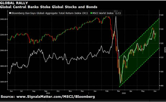
But just consider the following market chart.
The tanking red and white lines below represent debt-soaked stocks and life-supported bonds falling like Newton’s apple in early March.
The rising green wedge to the right represents what happens to those same balance-sheet-challenged stocks and bonds when the Fed prints a couple trillion bucks out of thin air just minutes later.
Et voila! The apples fall “up” with gravity-defying elan…

And that folks, is now what makes alleged capitalism (?) and free markets (?) tick in this new land of market Oz and Wall Street Socialism.
Chart No 2.—All You Need to Know About the Rot Within this Unnatural Market Rally and Unsustainably Rigged “Recovery”
Once upon a time, in those memorable days in which earnings rather than a Fed money printer drove stock performance, markets actually rose and fell based on transparent corporate governance, clear market signals and natural price discovery.
For now, however, all the stock market needs is a little help from Jay Powell and about 12 new zeros added to the money supply.
Still don’t believe me?
OK. Cool.
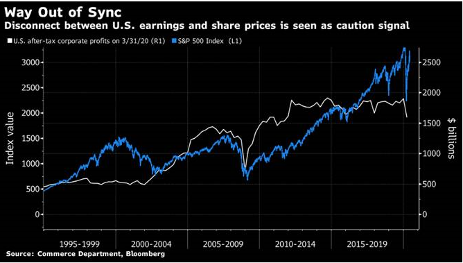
But just consider our second chart below.
The rising blue line represents the S&P tanking and then skyrocketing despite that stubborn little white line in free fall which represents the actual earnings of the companies which comprise the S&P…
Note how earnings just don’t matter when Powell has an itchy trigger finger on the money printer?

Well, in this new market abnormal where not even tanking earnings can keep a Fed-supported market down, I guess it’s fairly safe to say that the jig is officially up.
Stocks no longer move on silly ol’ things like profits and earnings, but survive instead on steroids from a central bank.
Like I said: It’s a Fed market, not a stock market.
Does the Fed Have Your Back?
But how long can this last?
Is it worth going all-in and riding this latest Fed wave?
That’s your call, but here at Signals Matter, we don’t fight nor fully trust the Fed.
The kind of fantasy demonstrated by the market charts above can only last for so long, as eventually all apples fall down rather than up from a shaking and increasingly volatile tree.
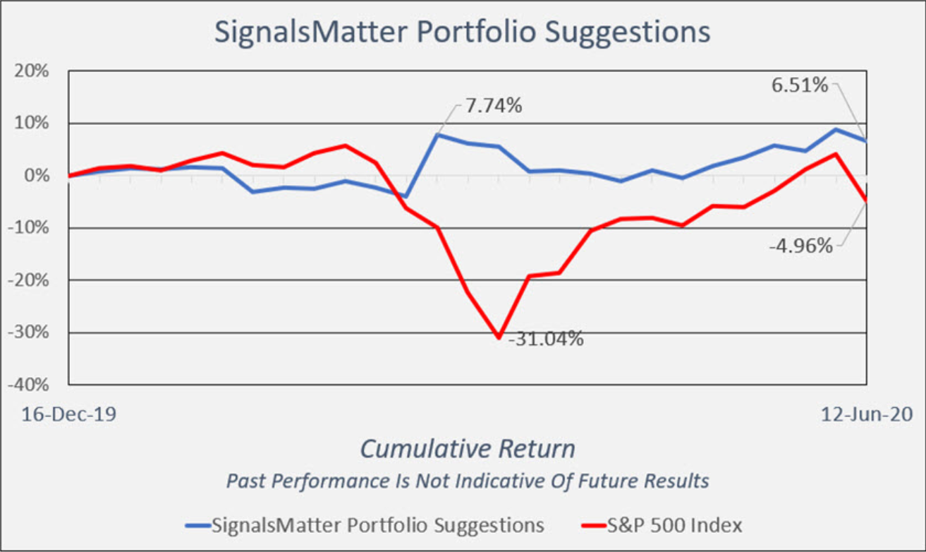
Rather than wait for gravity to return or engage in bull v bear rhetoric or market-timing shenanigans, we just stick to our signals, our sectors and our hedges, while our portfolio (in real-time, not “back-tested”) carefully yet steadily beats the market without all the crazy (above) that comes in between.

Our market approach is long-term, with a portfolio built to withstand, as well as navigate, reality rather than fantasy. If this makes sense to you, simply join us HERE.
Market charts like those above no longer scare or shock us, they simply confirm that markets are on a pathway to greater risk than reward, and hence a greater need for risk management than more top-chasing faith in rigged fantasy.
Thus, let us bid so long, farewell, aufwiedersehen and adieu to natural markets, real capitalism and honest price discovery.
The two market charts above confirm their now indisputable demise.
So, I think I’ll have that martini.
Have a great weekend. À votre santé.
Matt & Tom


Have a great time in Sarlat one of the best places for food in the world !
We live in the Limousin 15 mn off the motorway if you are heading back up north.
If it works for you – drop in and say hello !
Chris Smith
05 55 XX XX XX
A great spot indeed! Let’s find a table soon –M